Sonus Vitae – defining a therapy product
Sonus Vitae is a therapy practice developed from scratch, where I defined the product, brand, and digital experience end-to-end.
Starting with no audience, positioning, or content, I translated a complex therapy into a clear, accessible offering and delivered a production-ready website designed to support understanding, trust, and conversion.
Role
Product Designer, Design Engineer
Focus
Product definition, UX strategy, accessibility, end-to-end delivery
CONTEXT
The client, a newly certified practitioner, needed to establish a viable business.
There was no defined audience, unclear positioning, and a therapy that is not widely understood, making trust and clarity critical to adoption.
PROBLEM
The core challenge was to turn a complex and unfamiliar therapy into a clear, trustworthy product that people could understand and act on.
This required:
- Defining target segments without prior market validation.
- Structuring information to reduce cognitive load.
- Building credibility for a non-mainstream therapy.
- Ensuring accessibility for a broad and potentially vulnerable audience.
SOLUTION
Research & Product Definition
I used market and domain research, combined with the client’s experience, to define a clear product direction.
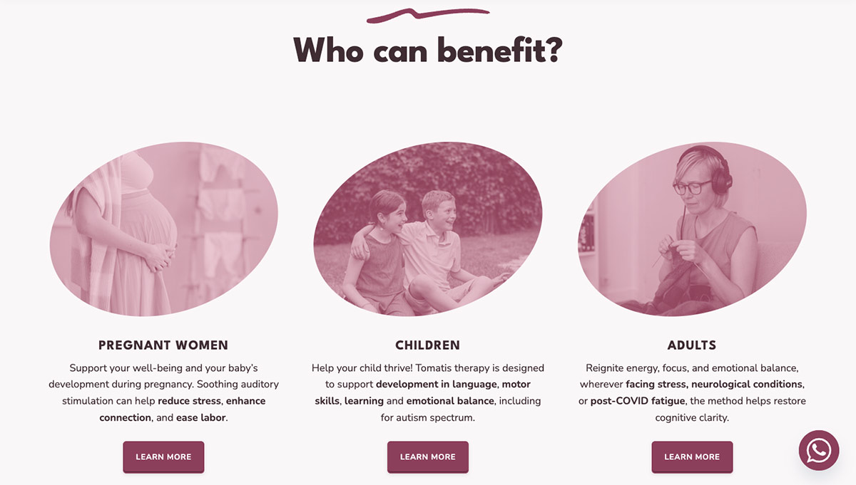
I identified two key segments:
- Pregnant women and parents/mothers, as the primary audience with the highest need and emotional motivation.
- Adults, as a secondary audience with broader but less urgent use cases.
Information Architecture & UX
I structured the experience to guide users from awareness to action:
- Clear entry points based on user type.
- Progressive disclosure of complex information.
- Strong emphasis on “What is this?” and “How does it help me?”.
The goal was to reduce uncertainty and support decision-making quickly.
Branding
The brand was designed to communicate care, trust, and transformation, while making a relatively unknown therapy feel approachable and safe.
The logo combines the outline of an ear and a brain, representing the connection between listening and cognitive development, the foundation of the therapy.
The form is intentionally simple and soft, avoiding a clinical or overly technical feel while remaining distinctive and recognizable.
The name Sonus Vitae (“sound of life”) reinforces the core principle of the therapy, using sound as a pathway to development and wellbeing.
A Latin name was chosen to create a universal and location-independent identity, supporting the client’s ability to operate across different countries.
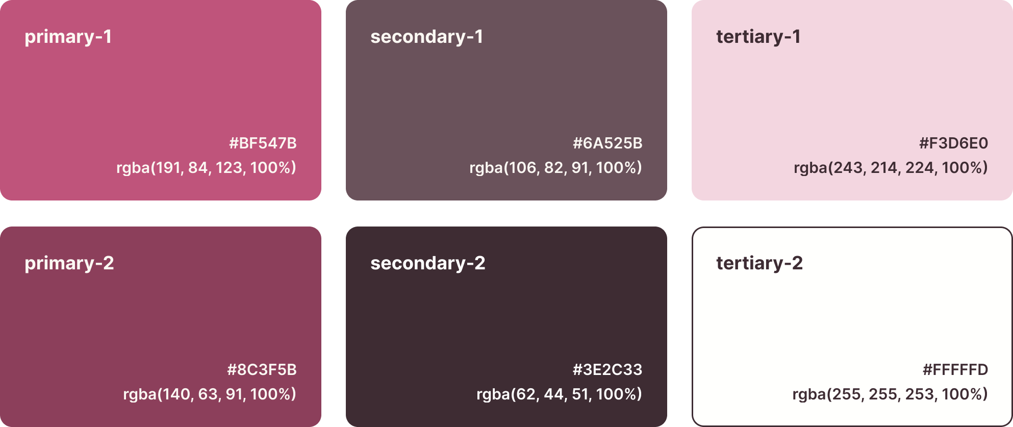
The visual identity uses a soft, warm colour palette to signal safety, empathy, and emotional support.
Deeper tones introduce contrast and stability, helping balance warmth with credibility.
Digital product
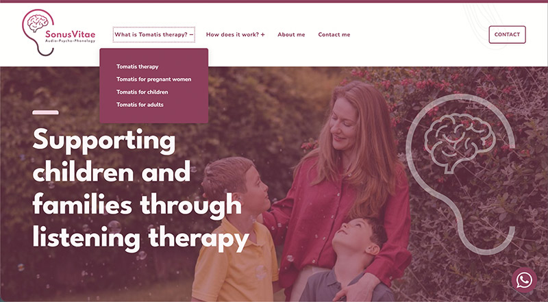
I designed and built a responsive website as the primary product touchpoint.
It balances education and conversion, helping users understand the therapy while guiding them toward contact and engagement.
Content strategy
The content strategy focused on making a complex therapy understandable in seconds.
I simplified terminology, removed jargon, and structured content around user questions rather than clinical explanations.
The tone was intentionally personal and conversational to build trust with parents.
Design and engineering
I implemented the product using WordPress, balancing flexibility for the client with performance and accessibility.
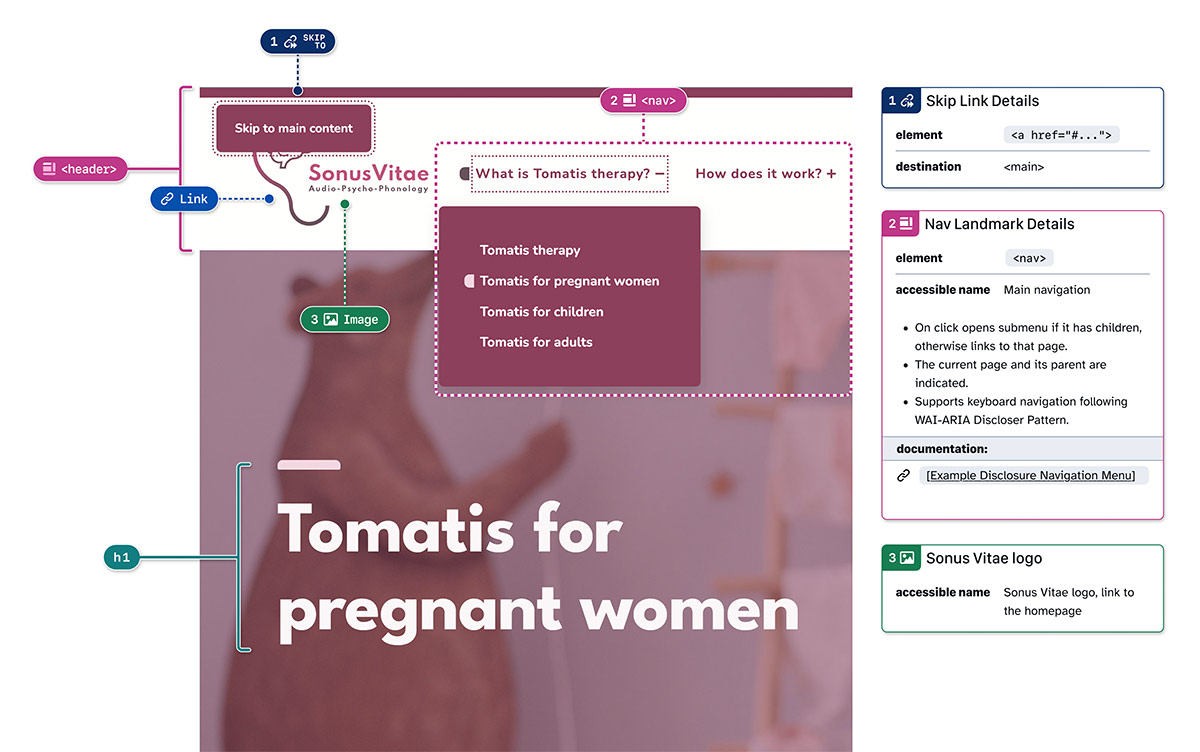
Accessibility was treated as a core product requirement, not an afterthought:
- Semantic structure and clear navigation for screen readers.
- Full keyboard operability.
- Accessible color contrast and non-color-based communication.
I validated the experience through automated and manual testing, ensuring it works across assistive technologies.
Outcome
- Transformed an undefined idea into a structured, ready-to-launch product.
- Established clear audience segmentation and messaging strategy.
- Delivered an accessible, maintainable website ready for production.
- Provided the client with the tools and clarity to independently operate and grow the business.
Role, Tools & technical skills
I worked independently across product definition, design, and implementation.
Tools and technical skills: Figma, GitHub Annotation Toolkit, WordPress, HTML5, CSS3, manual (keyboard, VoiceOver) and automated (axe DevTools, WAVE) accessibility testing.